Page 1 of 1
Btnbmp: Different look after link in FWH19.05
Posted: Wed Jul 03, 2019 4:03 am
by hua
Hi guys,
This command,
Code: Select all
@ nTop+= 25, nLeft BTNBMP  PROMPT "E&xit"                SIZE 150, 30 OF oDlg 2007 LEFT ;
   filename ud_bmpDir()+"\quit.bmp" ;
   ACTION ( oDlg:End(), oWnd:End() )
produces different result when I link in FWH19.05. Did I do something wrong?
Before:

After (with FWH19.05)

Re: Btnbmp: Different look after link in FWH19.05
Posted: Wed Jul 03, 2019 5:29 am
by ukoenig
Using spaces You can adjust the prompt-position.
( missing space on left prompt-adjustment )


prompt adjustment :


METHOD PaintBitmap() CLASS TBtnBmp
if ::nLayOut == LAYOUT_LEFT
...
...
::nBmpMargin := nMargin + nBmpWidth
+ 5
regards
Uwe

Re: Btnbmp: Different look after link in FWH19.05
Posted: Wed Jul 03, 2019 7:04 am
by nageswaragunupudi
Uwe
Still, it is not exactly like in FWH1108.
We need to provide some easy way to achieve that
Re: Btnbmp: Different look after link in FWH19.05
Posted: Fri Jul 05, 2019 3:04 pm
by nageswaragunupudi
Mr. Hua
It is true that in these 8 years, there have been some changes in the appearance.
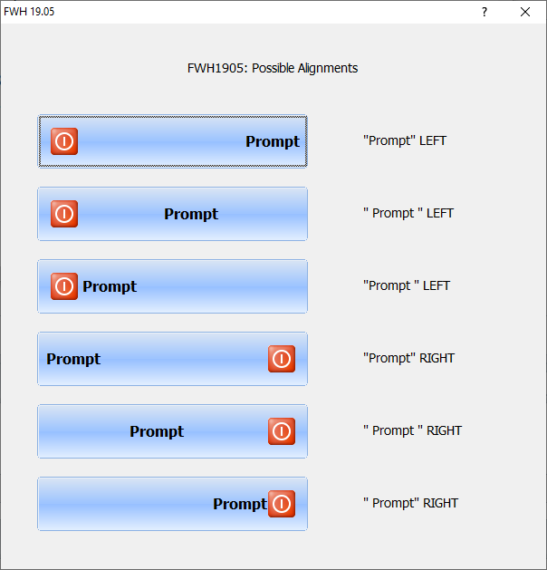
Presently, these are the possible arrangements:

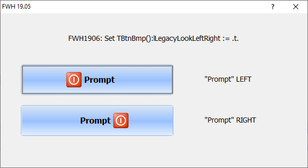
None of them exactly match the look in FWH1108. We are now providing a switch by way of CLASSDATA lLegacyLookLeftRight.
You may set this at the beginning of your application.
Code: Select all
TBtnBmp():lLegacyLookLeftRight := .t.
Then all your buttons with LEFT/RIGHT clauses will have the same look as in FWH1108.

Will this be ok for you?
Re: Btnbmp: Different look after link in FWH19.05
Posted: Fri Jul 05, 2019 3:35 pm
by hua
Yes! Thank you Rao
Re: Btnbmp: Different look after link in FWH19.05
Posted: Sun Oct 06, 2019 3:30 pm
by Rick Lipkin
Rao
All my buttons look like examples 1 or 2 .. and you can pad a few spaces in the front or the back of the prompt to place the text where you want .. With 1906 .. using the TBtnBmp():lLegacyLookLeftRight := .t. .. totally ignores any space padding and the text is snugged up close to the icon .. no spaces in between..
I actually like example 2 with the icon on the left a few pixels from the boundary of the edge of the button and the prompt in the center and if you want .. you can pad spaces to push the prompt manually to the right.
Thanks
Rick Lipkin


